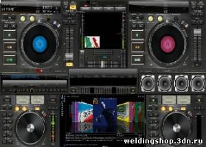
CSS3 анимации эксперимент - Virtual DJ
Сегодня подготовим хороший CSS3 эксперимент. Который отлично
впишется в музыкальный сайт. В этой демо только с CSS3 (без JavaScript). Я
использовал различные CSS3 техники, как ключевые кадры, анимации,
преобразование (вращение и масштабирование).
ДЕМО СКАЧАТЬ ИСХОДНИК
Итак, давайте начнем
Шаг 1. HTML
Все очень просто. Как вы можете видеть - он содержит много
различных изображений.
<div
class="vdj">
<img src="images/back.jpg">
<img class="v1" src="images/v1.png">
<img class="v2" src="images/v2.png">
<img class="v3" src="images/v3.png">
<img class="v4" src="images/v4.png">
<img class="s1" src="images/speaker.png">
<img class="si1" src="images/speaker-in.png">
<img class="s2" src="images/speaker.png">
<img class="si2" src="images/speaker-in.png">
<img class="s3" src="images/speaker.png">
<img class="si3" src="images/speaker-in.png">
<img class="s4" src="images/speaker.png">
<img class="si4" src="images/speaker-in.png">
<img class="slid1" src="images/slid1.png">
<img class="slid2" src="images/slid1.png">
<img class="b1" src="images/but1.png">
<img class="b2" src="images/but2.png">
<img class="b3" src="images/but3.png">
<img class="b4" src="images/but1.png">
<img class="b5" src="images/but2.png">
<img class="b6" src="images/but3.png">
<img class="eq" src="images/space.gif">
<img class="eq2" src="images/space.gif">
</div>
Шаг 2. CSS
Теперь пришло время, чтобы создать стиль наших
музыкальных демо-версии. Не забудьте подключить CSS файл в головной
части страницы .
CSS
/ main.css
/* virtual
dj */
.vdj {
margin: 100px auto 0;
position: relative;
width: 800px;
}
/* vinyl
keyframes */
@-webkit-keyframes
vinyl {
0% {
-moz-transform: rotate(0deg);
-webkit-transform: rotate(0deg);
}
100% {
-moz-transform: rotate(360deg);
-webkit-transform: rotate(360deg);
}
}
@-moz-keyframes
vinyl {
0% {
-moz-transform: rotate(0deg);
-webkit-transform: rotate(0deg);
}
100% {
-moz-transform: rotate(360deg);
-webkit-transform: rotate(360deg);
}
}
.v1, .v2,
.v3, .v4 {
/* css3 animation */
-moz-animation-name: vinyl;
-moz-animation-duration: 3s;
-moz-animation-timing-function: linear;
-moz-animation-iteration-count: infinite;
-moz-animation-direction: normal;
-moz-animation-delay: 0;
-moz-animation-play-state: running;
-moz-animation-fill-mode: forwards;
-webkit-animation-name: vinyl;
-webkit-animation-duration: 3s;
-webkit-animation-timing-function: linear;
-webkit-animation-iteration-count: infinite;
-webkit-animation-direction: normal;
-webkit-animation-delay: 0;
-webkit-animation-play-state: running;
-webkit-animation-fill-mode: forwards;
}
.v1 {
left: 83px;
position: absolute;
top: 77px;
}
.v2 {
left: 580px;
position: absolute;
top: 77px;
}
.v3 {
left: 66px;
position: absolute;
top: 382px;
}
.v4 {
left: 634px;
position: absolute;
top: 382px;
}
/* speaker
keyframes */
@-webkit-keyframes
speaker {
0% {
-moz-transform: scale(0.75);
-webkit-transform: scale(0.75);
}
45% {
-moz-transform: scale(0.85);
-webkit-transform: scale(0.85);
}
100% {
-moz-transform: scale(0.75);
-webkit-transform: scale(0.75);
}
}
@-moz-keyframes
speaker {
0% {
-moz-transform: scale(0.75);
-webkit-transform: scale(0.75);
}
45% {
-moz-transform: scale(0.85);
-webkit-transform: scale(0.85);
}
100% {
-moz-transform: scale(0.75);
-webkit-transform: scale(0.75);
}
}
.si1, .si2,
.si3, .si4 {
/* css3 transform */
-webkit-transform:scale(0.75);
-moz-transform:scale(0.75);
-ms-transform:scale(0.75);
-o-transform:scale(0.75);
transform:scale(0.75);
/* css3 animation */
-moz-animation-name: speaker;
-moz-animation-duration: 0.5s;
-moz-animation-timing-function: linear;
-moz-animation-iteration-count: infinite;
-moz-animation-direction: normal;
-moz-animation-delay: 0;
-moz-animation-play-state: running;
-moz-animation-fill-mode: forwards;
-webkit-animation-name: speaker;
-webkit-animation-duration: 0.5s;
-webkit-animation-timing-function: linear;
-webkit-animation-iteration-count: infinite;
-webkit-animation-direction: normal;
-webkit-animation-delay: 0;
-webkit-animation-play-state: running;
-webkit-animation-fill-mode: forwards;
}
.si1 {
left: 541px;
position: absolute;
top: 249px;
}
.s1 {
left: 545px;
position: absolute;
top: 253px;
}
.si2 {
left: 606px;
position: absolute;
top: 249px;
/* css3 animation delay */
-moz-animation-delay: 0.25s;
-webkit-animation-delay: 0.25s;
}
.s2 {
left: 610px;
position: absolute;
top: 253px;
}
.si3 {
left: 671px;
position: absolute;
top: 249px;
}
.s3 {
left: 675px;
position: absolute;
top: 253px;
}
.si4 {
left: 735px;
position: absolute;
top: 249px;
/* css3 animation delay */
-moz-animation-delay: 0.25s;
-webkit-animation-delay: 0.25s;
}
.s4 {
left: 739px;
position: absolute;
top: 253px;
}
/* slider
keyframes */
@-webkit-keyframes
slider {
0% {
margin-top:0px;
}
50% {
margin-top:90px;
}
100% {
margin-top:0px;
}
}
@-moz-keyframes
slider {
0% {
margin-top:0px;
}
50% {
margin-top:90px;
}
100% {
margin-top:0px;
}
}
.slid1,
.slid2 {
/* css3 animation */
-moz-animation-name: slider;
-moz-animation-duration: 2.0s;
-moz-animation-timing-function: linear;
-moz-animation-iteration-count: infinite;
-moz-animation-direction: normal;
-moz-animation-delay: 0;
-moz-animation-play-state: running;
-moz-animation-fill-mode: forwards;
-webkit-animation-name: slider;
-webkit-animation-duration: 2.0s;
-webkit-animation-timing-function: linear;
-webkit-animation-iteration-count: infinite;
-webkit-animation-direction: normal;
-webkit-animation-delay: 0;
-webkit-animation-play-state: running;
-webkit-animation-fill-mode: forwards;
}
.slid1 {
left: 254px;
position: absolute;
top: 94px;
}
.slid2 {
left: 751px;
position: absolute;
top: 94px;
/* css3 animation delay */
-moz-animation-delay: -1.0s;
-webkit-animation-delay: -1.0s;
}
/* buttons
keyframes */
@-webkit-keyframes
buttons {
0% {
opacity: 1;
}
45% {
opacity: 0;
}
100% {
opacity: 1;
}
}
@-moz-keyframes
buttons {
0% {
opacity: 1;
}
45% {
opacity: 0;
}
100% {
opacity: 1;
}
}
.b1, .b2,
.b3, .b4, .b5, .b6 {
/* css3 animation */
-moz-animation-name: buttons;
-moz-animation-duration: 1.0s;
-moz-animation-timing-function: linear;
-moz-animation-iteration-count: infinite;
-moz-animation-direction: normal;
-moz-animation-delay: 0;
-moz-animation-play-state: running;
-moz-animation-fill-mode: forwards;
-webkit-animation-name: buttons;
-webkit-animation-duration: 1.0s;
-webkit-animation-timing-function: linear;
-webkit-animation-iteration-count: infinite;
-webkit-animation-direction: normal;
-webkit-animation-delay: 0;
-webkit-animation-play-state: running;
-webkit-animation-fill-mode: forwards;
}
.b1 {
left: 17px;
position: absolute;
top: 105px;
}
.b2 {
left: 17px;
position: absolute;
top: 147px;
/* css3 animation delay */
-moz-animation-delay: 0.3s;
-webkit-animation-delay: 0.3s;
}
.b3 {
left: 17px;
position: absolute;
top: 190px;
/* css3 animation delay */
-moz-animation-delay: 0.6s;
-webkit-animation-delay: 0.6s;
}
.b4 {
left: 513px;
position: absolute;
top: 105px;
/* css3 animation delay */
-moz-animation-delay: 0.3s;
-webkit-animation-delay: 0.3s;
}
.b5 {
left: 513px;
position: absolute;
top: 147px;
/* css3 animation delay */
-moz-animation-delay: 0.6s;
-webkit-animation-delay: 0.6s;
}
.b6 {
left: 513px;
position: absolute;
top: 190px;
}
/* eq
keyframes */
@-webkit-keyframes
eq {
0% {
background-position: 0 0;
}
100% {
background-position: 0 -92px;
}
}
@-moz-keyframes
eq {
0% {
background-position: 0 0;
}
100% {
background-position: 0 -92px;
}
}
.eq {
background: url("../images/eq.png") no-repeat scroll center top
transparent;
height: 92px;
left: 197px;
position: absolute;
top: 389px;
width: 18px;
/* css3 animation */
-moz-animation-name: eq;
-moz-animation-duration: 2.0s;
-moz-animation-timing-function: linear;
-moz-animation-iteration-count: infinite;
-moz-animation-direction: normal;
-moz-animation-delay: 0;
-moz-animation-play-state: running;
-moz-animation-fill-mode: forwards;
-webkit-animation-name: eq;
-webkit-animation-duration: 2.0s;
-webkit-animation-timing-function: linear;
-webkit-animation-iteration-count: infinite;
-webkit-animation-direction: normal;
-webkit-animation-delay: 0;
-webkit-animation-play-state: running;
-webkit-animation-fill-mode: forwards;
}
/* eq2
keyframes */
@-webkit-keyframes
eq2 {
0% {
background-position: 0 0;
}
100% {
background-position: -260px 0;
}
}
@-moz-keyframes
eq2 {
0% {
background-position: 0 0;
}
100% {
background-position: -260px 0;
}
}
.eq2 {
background: url("../images/eq2.png") no-repeat scroll center top
transparent;
height:
28px;
left: 271px;
position: absolute;
top: 240px;
width: 260px;
/* css3 animation */
-moz-animation-name: eq2;
-moz-animation-duration: 6.0s;
-moz-animation-timing-function: linear;
-moz-animation-iteration-count: infinite;
-moz-animation-direction: normal;
-moz-animation-delay: 0;
-moz-animation-play-state: running;
-moz-animation-fill-mode: forwards;
-webkit-animation-name: eq2;
-webkit-animation-duration: 6.0s;
-webkit-animation-timing-function: linear;
-webkit-animation-iteration-count: infinite;
-webkit-animation-direction: normal;
-webkit-animation-delay: 0;
-webkit-animation-play-state: running;
-webkit-animation-fill-mode: forwards;
}
Я думаю, что все должно быть не очень сложным для вас.
ДЕМО СКАЧАТЬ ИСХОДНИК
Источник
урока
Заключение
Вот и все, сегодня мы создали новую анимированную
демонстрацию с использованием CSS3. Вы можете свободно
модифицировать наш результат и использовать его на своих сайтах. Не
стесняйтесь поделиться с друзьями. Удачи!
| 